Wireframes


Site Analysis
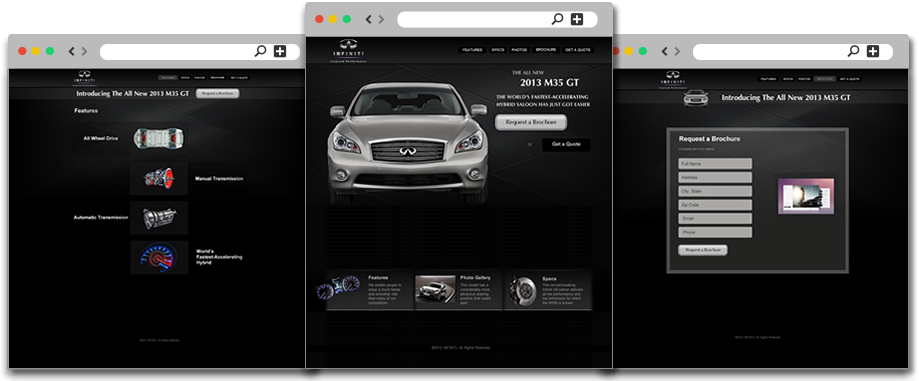
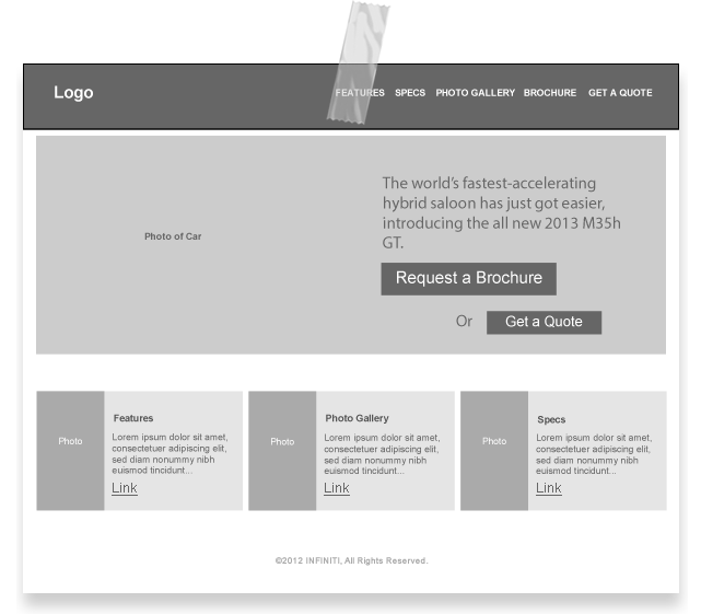
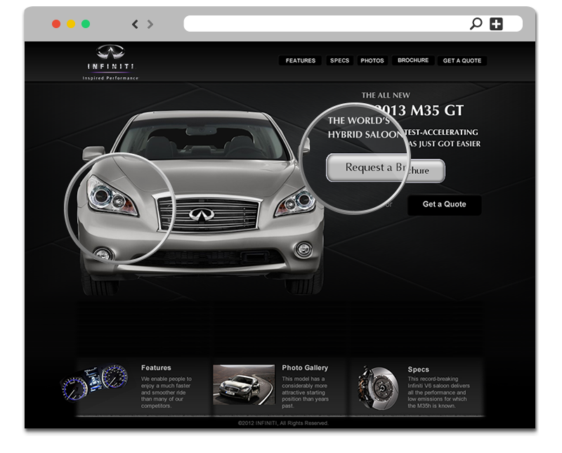
Landing Page
In an attempt to truly and immediately capture Infiniti's brand identity of luxury, I went with a contrasting backdrop to the M35 GT allowing its beautiful shine to be clearly visible to visitors. The intention of this site is to ultimately have visitors ask for a quote, but the art of a sale is a process that requires patience. Utilizing this knowledge, I added two call to action buttons leveraging the "contrast effect", both in design and action. Visitors are more likely to consider what seems like a passive action (requesting more vehicle information) when presented alongside a more aggressive one (requesting a price quote), especially if the aggressive option uses sharper language with words such as "get" as opposed to softer ones such as "request". By design, I made the more passive "request a brochure" button the brighter more attractive option while also matching it with the M35 GT's color and tone creating a stronger association.
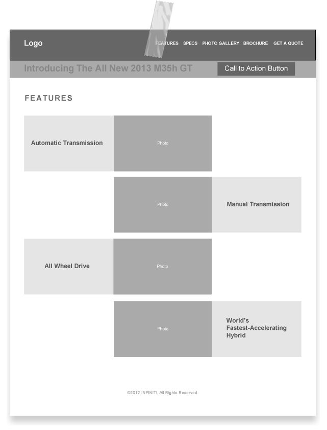
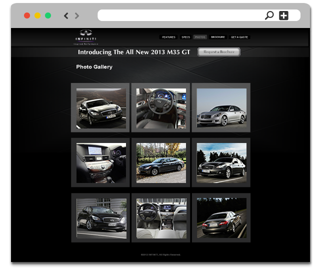
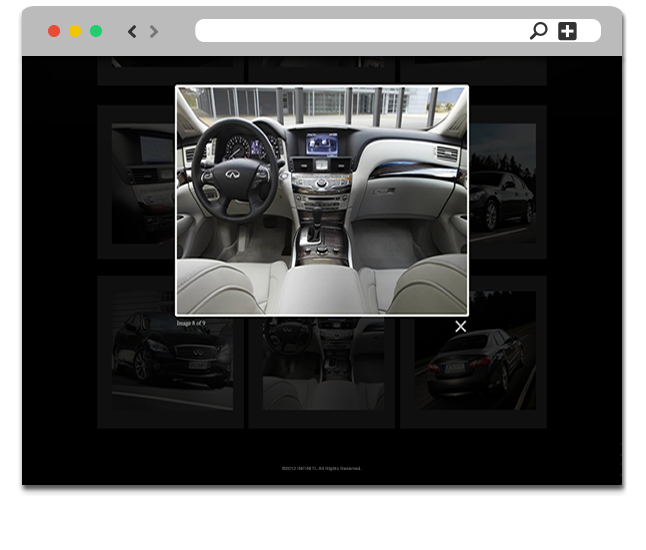
Providing a Closer Look
The next natural step for a visitor is to try and gain a clearer visual representation of the site's product offering. I took the liberty to display alternative angles, vantage points, and colors of the M35 GT as visitors may have a preference for them. As can be seen the call to action area has been placed towards the top of the page to give visitors the option to request a brochure whenever they're ready. I removed the option to get a quote as it would at this point disturb the user experience and intention of this page which is to allow the visitor to simply "look around".
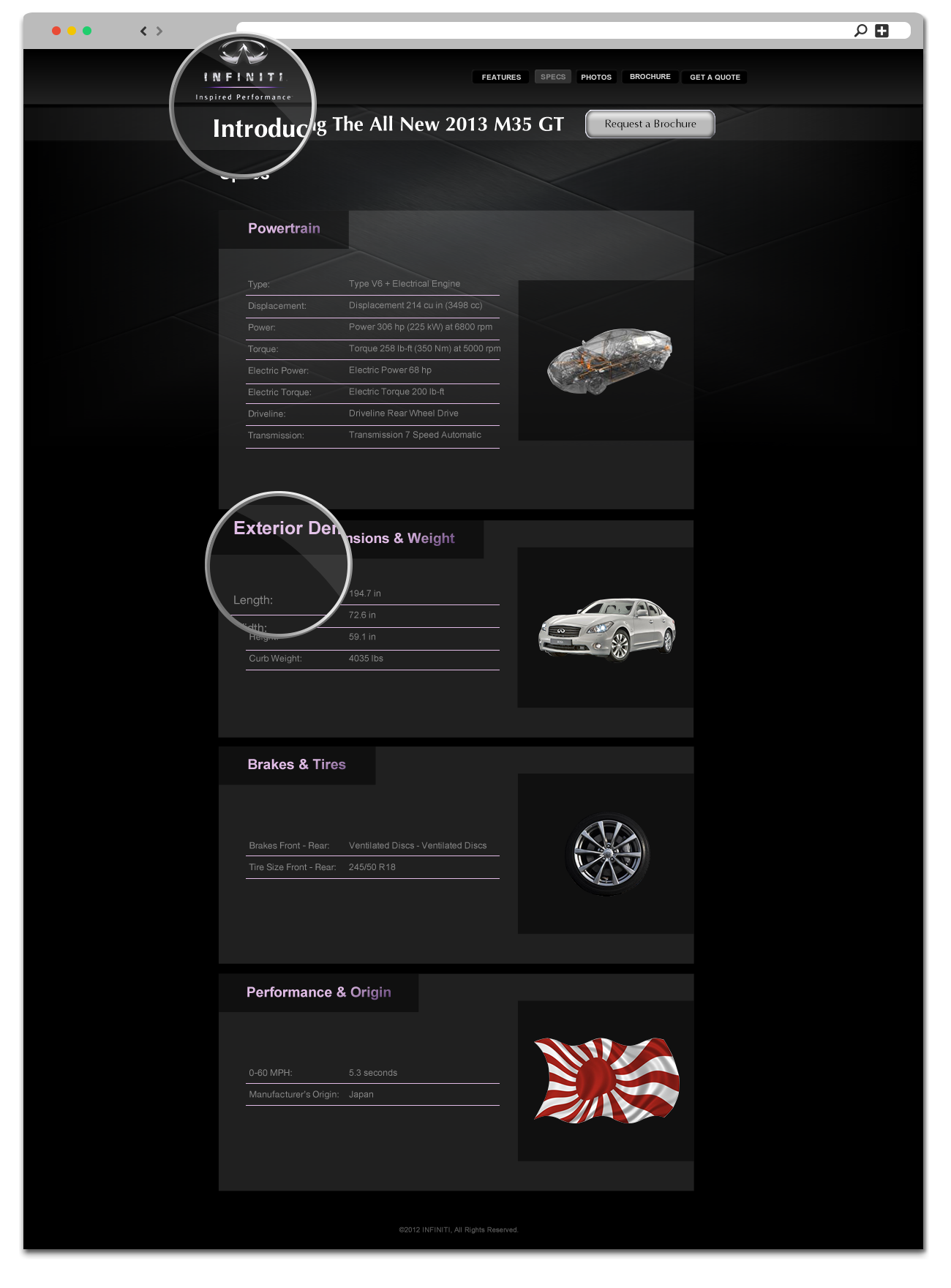
Displaying Value
This page outlines in detail the specifications of the M35 GT to those who care for this sort of information. As can be seen at the top left of this page (and all others) I chose to go with Infiniti's alternative chrome logo design adding to the overall feel of luxury. With the design concept for this page, because its target audience most likely will consist of people who are really interested in the finer details of a car's performance capabilities I decided to give it a more sporty feel. I achieved this by adding a neon color effect to the page's spec categories (i.e. Powertrain, etc.) that can also be seen subtly throughout the entire site to help blend with the overall layout.
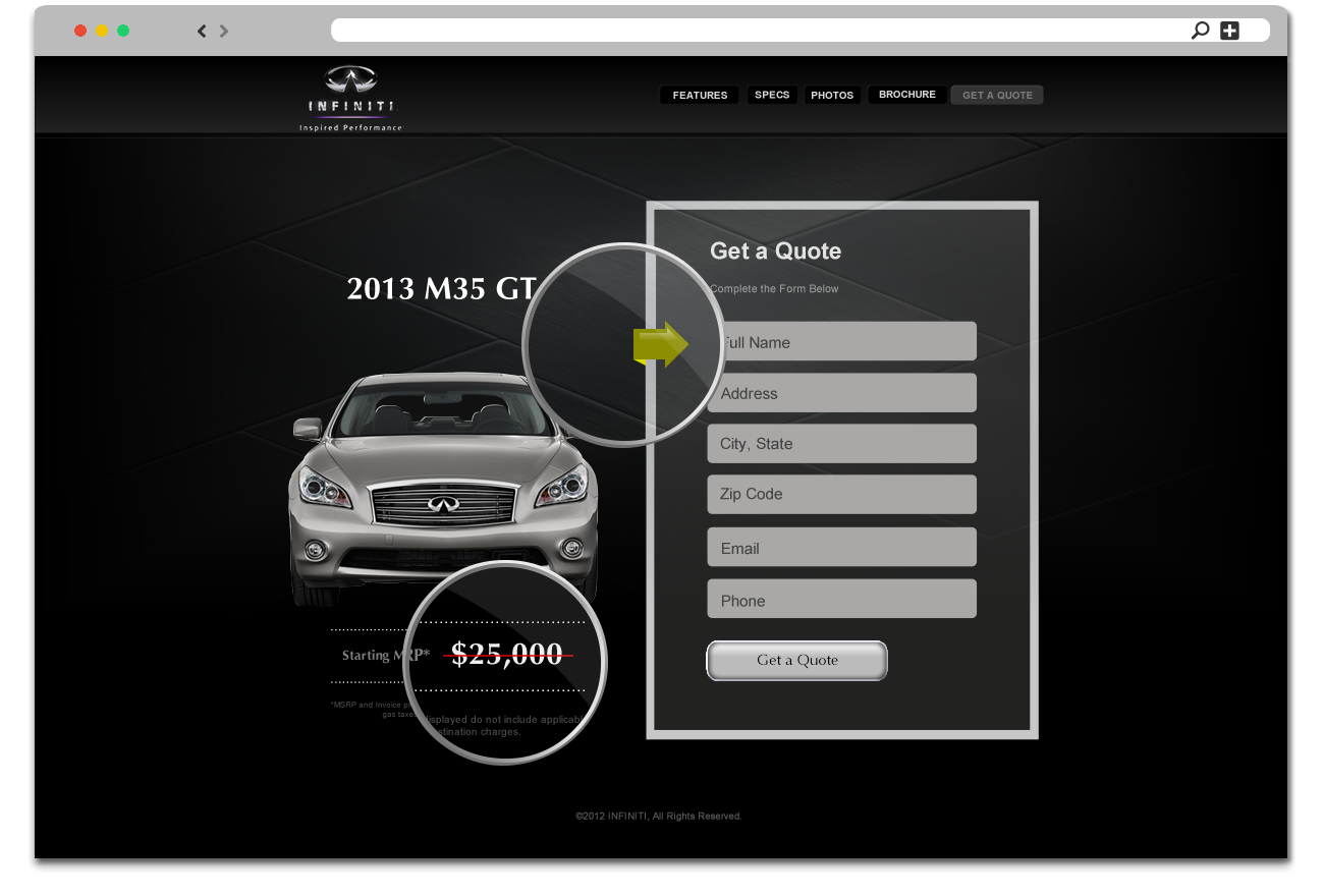
Closing a Client
Upon visiting this page to request a price quote, visitors will immediately discover a distinct red line that crosses out the manufacturer's suggested retail price. This is intended to further peak the visitors interest into filling out the form on the right. Along the form is an arrow with a color that is designed to pop and draw attention to its location (pointing to the first form field) without drastically contrasting against the overall color scheme of the page. The form container not only follows the design convention of being placed to the right (majority of visitors typically prefer to view elements of a page from left to right) but it also has a contrasting white border surrounding it for maximum attention.