Wireframes

Site Analysis
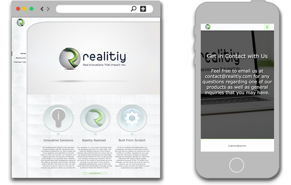
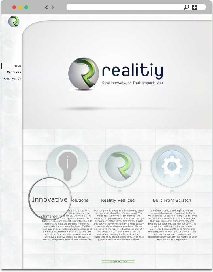
Setting The Tone
In coming up with the design for this site, I not only wanted it to complement the company's logo but also extend upon its unique and compelling features. To do this I began by using a white backdrop as to not distract from the rest of the layout. I also used a unique overarching navigation menu which is composed of white crystals throughout. I added a VFX video clip (in which I edited) containing Realitiy's logo, name, and tagline to increase the design's overall quality. I designed circular placeholders to accentuate the body content's image headers matching them with the metallic portion of the Realitiy logo. I believed these design features to be integral in delivering an experience that is consistent and unique to what the company stands for.
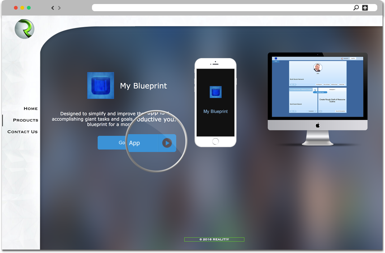
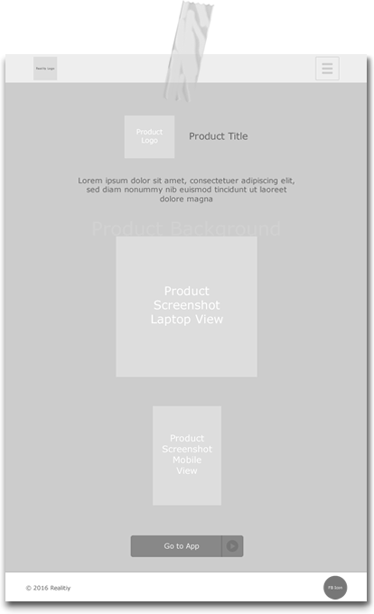
Presenting Products
For the company's product display page, I here too used a minimalistic design structure with a touch of uniqueness. The touch was added to where if a visitor were to hover over the "Go to App" button the transparent section of it (the button) would progressively change, within a few seconds, to the primary color of the product's logo in this case being blue. I also created and utilized display images of the product in use on different devices.